For this Final Project, we were to create two high quality maps to the best of our ability.Over the semester the class discussed several mapping techniques that could be used for these final maps, such as choropleth mapping, dot mapping, isarithmic mapping, and proportional symbol mapping.The first map I Created was a Qualitative map, where different hues are used to represent different qualities of the data.This map satisfies the portrait orientation and the inset map requirements.For the second map, a bivariate mapping technique was used, where two different techniques are shown.This bivariate map is basically a standardized choropleth map (satisfying the classified requirement) with a graduated symbol map on top of it.
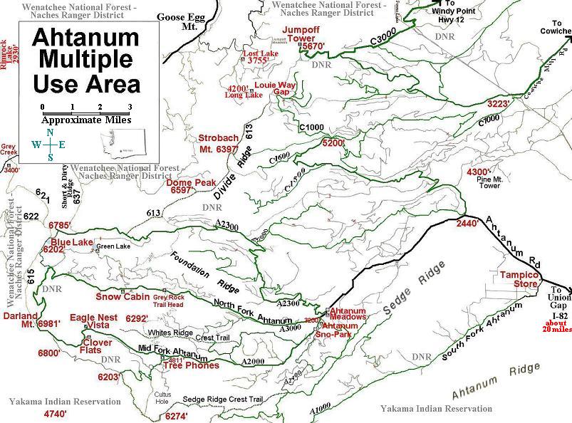
This map is of the Ahtanum State Forest in Washinton State. It shows the various trails, elevations, and possible destinations in the area. This map was found on the website for the All Wheelers Off Road Club.
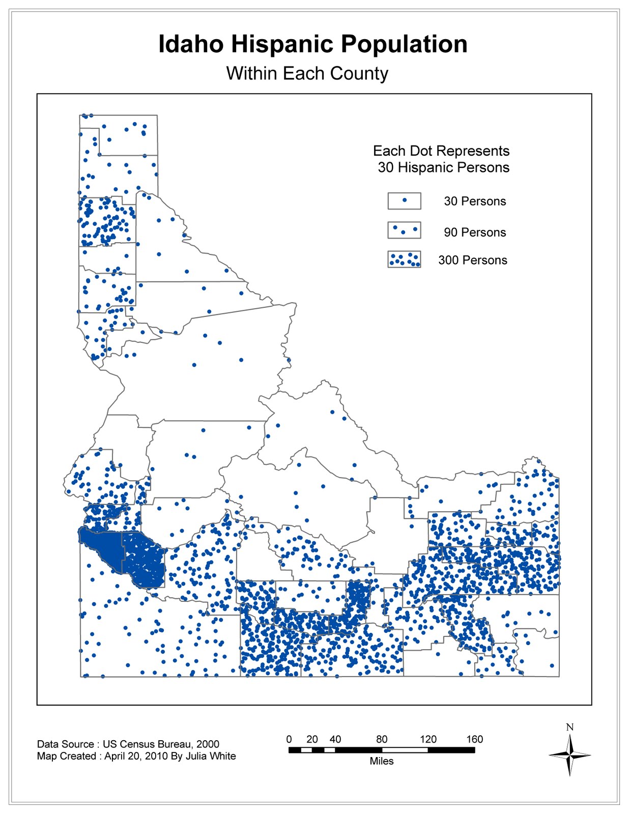
This is a dot map showing the Hispanic population in each county of Idaho.Each dot represents 30 people and highly populated areas are easily determined.Data for this map came from the U.S. Census Bureau for the year 2000.
Part B1
This is a map of the capital cities in the world with a population greater than 750,000, where graduated circles are used for symbolization.The different color values for each symbol were used to help distinguish each circle.Data for this map came from ESRI.
Part B2
This is a bivariate map of people in the Buffalo area that are 65 years old or older.The choropleth map shows the percentage of elderly in each census tract.The proportional map shows the number of elderly in each tract.Data for this map came from SUNY-Buffalo.
This is a map showing the Calista Region in the Yukon-Kuskoquim River Delta. It is the area where most Yup'ik Eskimo people call home. Within the region are 56 village corporations and the map shows their name and location. This river delta is a relatively flat marshy plain crisscrossed with many waterways and temperatures there range between -80F and 80F.
This map shows the annual precipitation in Idaho, based on values from weather stations scattered throughout the state.The Inverse Distance Weighting Method was used to create the values that cover the state and the contour option in the spatial analyst toolbar was used to create the contour lines.For the interpolation, the optimal power value was calculated and 15 neighbors were used.Using this color scheme made the most sense to me for representing precipitation. To make the contour line numbers stand out a bit better, a small halo was added to them and they were then shifted to make them easier to read.To explain more about the contour lines, text was added to the map for clarification.
Part 2
This map shows the annual precipitation in Idaho, based on values from weather stations scattered throughout the state.The Ordinary Kriging Method was used to create the values that cover the state and the contour option in the spatial analyst toolbar was used to create the contour lines.For this interpolation, the best RMS value was found be of the Exponential model using 10 neighbors and a calculated lag with 12 lags.Using this color scheme made the most sense to me for representing precipitation.To make the contour line numbers stand out a bit better, a small halo was added to them and they were then shifted to make them easier to read.To explain more about the contour lines, text was added to the map for clarification.
On Saturday February 27, 2010, a magnitude 8.8 earthquake hit near Maule, Chile. This is a map of the estimated tsunami wave heights at various hours after the quake struck.